Product
New Feature: Updated Design For Payment Forms
Dodd Caldwell
July 21, 2020

You may have noticed that we’ve just made some minor updates to the design of our default theme for payment forms. All of these changes are purely aesthetic to help modernize the form design a little bit and don’t affect the functionality of your forms at all.
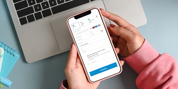
Here is what the 2nd page of the checkout looks like with the new default theme:

And here is what the old default theme looked like:

Here are a few notes about the switch to the new default theme:
- If you have any existing forms that have been using the default theme, we’ve automatically applied the updated design to those forms.
- If you create any new form and use the default theme, you’ll see the updated design.
- If you’ve created any custom themes in the past and applied those themes to forms, we haven’t adjusted those themes at all. So, they will look the exact same as before.
- If you create a new theme and apply custom colors, fonts, etc to that new theme, the design elements from our new default will apply to those custom themes.
- If you’d like to continue using the old default theme, please let us know and we can accommodate that as well.
We hope you like this updated design. Please let us know if you have any feedback!


